It’s hard to understand or even believe the contagious way that obesity has spread virally around the world - so Max Galka created this visualisation
The rise of adult obesity 1975-2014. (click on link to see)
The colour of each country represents its adult obesity rate.
The colour of each country represents its adult obesity rate in the year shown.
Hover over a country to see what its obesity rate was in 1975 and what it is today.
...Since 1975, obesity rates have risen in every country in the world, without exception.
That includes countries like the United States and the UK, where food is cheap and abundant, and countries like Somalia and Angola, where malnutrition remains an epidemic.
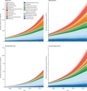 At the low end, North Korea’s obesity rates are up about 1% (from 1.6% in 1975 to 2.8% today).
Japan is also near the bottom with a 2% increase since 1975 (from 1.1% to 3.3%).
The largest changes occurred in smaller Pacific island countries. Samoa, Tonga, and Tuvalu all saw their obesity rates increase by more than 20%, a doubling of what they were in 1975.
Perhaps the country that stands out most of all is China.
In 1975, only 0.5% of Chinese adults were obese. Today, China’s obesity rate is about 8%, a 16-fold increase in the most populous country in the world.
Globally, the average adult today is three times as likely to be obese compared to the average adult in 1975..."
Read on.
No comments:
Post a Comment